Friday, June 14, 2013

Feature Friday: Pepper Design

Today I am featuring the home of blogger Morgan from the blog, Pepper Design. Here is what she says she loves most about her home. 

I love our family's home because to me it feels, in one word, cozy. It's a personal reflection of our casual, comfortable style with a little bit of 'homey eclecticness' running throughout :). I've always felt that home should feel like a big warm embrace - a safe and happy place to call your castle! Ours happens to be a 1930's Spanish casa (very much the architectural style of our local San Diego) in need of much remodel love, but that has allowed us to fill it with design decisions that are truly our favorites and to slowly build on the layers of personal style over time. It's okay if it's a little messy, a little crazy, a little too kid-friendly at times because it's us. We are a far, far cry from finished, but loving the process all of the while.

Enjoy! 

L I V I N G   R O O M 


K I T C H E N


D I N I N G   R O O M


M A S T E R   B E D R O O M


O F F I C E / G U E S T   R O O M 


N U R S E R Y 


B A C K Y A R D

You can read more about this DIY succulent planter box here. 


Thanks so much to Morgan for sharing her home with us. Make sure you check out her blog here! 

Go here to check out past Feature Fridays.

Thursday, June 13, 2013

DIY Scroll Style Picture Frames


Today we have a fun art tutorial from my contributor, Brittany! She is constantly coming up with great projects on her blog, brittanyMakes. I LOVE her latest DIY project as a new take on hanging posters and prints. 

* * * * * * * * * * * * * * * * * * * * * * * * * * * *


Hanging or framing a piece of art or photo can be tricky, especially if the item you're wishing to display is of a random size or shape.  There's nothing I like less than having to custom frame something - it's just so expensive! 

I like thinking of creative ways to display art and prevent ever having to deal with the process of custom framing. If I do need a frame, I usually turn to Ikea, but in some cases Ikea's selection of frames just doesn't quite measure up.


I bought some fun wrapping paper from PaperSource the other day that I wanted to display in our living room, in particular, a gorgeous sheet of marbled paper and a vintage map of Italy.  I came up with this incredibly easy method to hang them using 4 ingredients: brass bolts, 1" wood trim, paint, and twine.  

Here are the three easy steps to create this exact frame:


1. Using a can of spray primer, prime your pieces of trim.  I used 1" beveled trim from which you can easily find in the trim/crown moulding section of your hardware store
2. Paint the trim in our color of choice. I made two frames, one in a glossy black and the other in a soft gold.  
3. Assemble using brass bolts and a power drill. I found it best to first drill a pilot hole into each piece of trim, screw in the first bolt on one end, then tuck the art print between the two pieces of trim, and then, screw the trim shut on the opposite end with the other bolt.  Repeat this for the opposite end of the art print.

Lastly, attach some twine, ribbon, or cord to the back ends of the bolts, and hang!


The possibilities are endless with this framing techique.  You can give your frame a vintage feel by distressing the paint and using hemp cord or burlap ribbon.  Or, if you want a more chic look, choose a bright glossy paint and some velvet ribbon.  

Learn about all of my great contributors on my Meet The Team Page. 
* * * * * * * * * * * * * * * * * * * * * * * * * * * *

Hi! I'm Brittany from the blog brittanyMakes, where I journal my adventures in DIY projects ranging from everyday home decor to handmade jewelry, from tips in photography to stories of bulldogs, and everything else in-between.   I am a fierce accountant by day and a zealous DIYer by night.  I spend my time balancing my love for home decor and design with the everyday responsibilities of my corporate day job.  My main mission is to inspire my readers to do what they love, take risks, and above all, to exercise their creative muscles!

Tuesday, June 11, 2013

Tips for Building a New Home on a Small Budget

I've received some reader emails about what to spend their money on when building a new house. Most of us stretch financially to get into our homes in the first place and we don't have a lot left over for upgrades. We saved for four years to buy our townhome and when we went to the design center to choose finishes and upgrades we realized we didn't have a lot left over for all the "extras".  I had really been looking forward to choosing fun options for our new house but when we showed up I realized the options in our budget weren't the options I had been dreaming of.

SAVE //  I, like many many others, really love white kitchens. I set my heart on something like this:


image via House Beautiful 

However when we went to choose our cabinets I learned white cabinets would be an extra $3,000... gulp. Not in the budget. So we went with brown instead. They were a $0 upgrade.


I chose a modern shaker style that I really like. Because I couldn't have the color I wanted I decided to choose the shape and style I wanted. We can always paint later. I also wanted a beautiful marble countertop but had to settle for white laminate instead. That was another $0 upgrade. 

We also decided to opt out on a backsplash and did it ourselves a couple of years later. 

SPLURGE // We decided to go with hardwood (fake hardwood) floors on our main floor instead of the standard tile. I'm really glad we did this because re-flooring would have been a major pain later on. I am not going to lie though, the dark hardwood shows everything!

The paint color used throughout most of my home is Benjamin Moore's Hazy Skies. 


SAVE //  We had our whole house painted white. We saved a lot by doing one tone instead of two. I figured I'd rather paint walls than ceilings, baseboards and doors.  We later decided on a paint color for the walls but painting our entire house by ourselves was torture. I wish we had paid to just have it done but it saved us a lot of money. I also didn't want to just pick a color at the design center and cross my fingers that it worked out. I wanted to live in my house for a few months and really make the right decision on paint.

 image by Jessica Kettle Photography

SPLURGE // This may seem utterly ridiculous but we upgraded all our doors for $200. At first my husband thought I was crazy that I was so insistent on it but I'm so glad we did it. I love the modern look of the three panels and for some reason it makes my whole home feel more custom. It fits the style of my home so well.  Changing your doors is not really something you are going to want to do later so I'm glad I made this decision upfront.

left image by Britta Anne Photography and right image by Jessica Kettle Photography 

SAVE // We decided against having our windows framed out and just did it a few years later ourselves. The above pictures are of the same window in Jett's room. Before we had our windows framed out I disguised our lack of framing with high and wide curtains.


SPLURGE // The best decision we made was to vault our upstairs ceilings. This upgrade was a significant amount but so worth it in my opinion. The vault makes our teeny tiny rooms feel so much bigger. A ceiling vault is something you wouldn't be able to just add on later so it was a good investment upfront. 

SPLURGE // Anything behind the walls is always good to do upfront. We wired our downstairs basement for surround sound because it's something we'd never be able to do afterwards.

Overall just prioritize what things are most important to you. You will make mistakes but it will help you make better decisions when you go to build your next house!

What are the best or worst decisions you all have made in building your homes? 

Monday, June 10, 2013

Etsy Summer Roundup

I'm back with a summer-inspired Etsy roundup.  Summer is my favorite season. I love the bright colors, summer fashion and happy decor!


1. 2. 3. 4. 5. 6. 7. 8. 9. 10. 11. 12. 13. 14. 15. 16. 

Friday, June 7, 2013

Feature Friday: Jana Bek

I am really happy and excited to share with you this amazing Studio apartment today. I think most of us are all struggling with expensive taste and small budgets. It's always a challenge to create a home you feel is beautiful but also do it a way that you can afford. I think this is especially challenging for Interior Designers! Jana Bek is an incredibly talented designer who knows just how that feels. Here is what she says she loves most about her home:

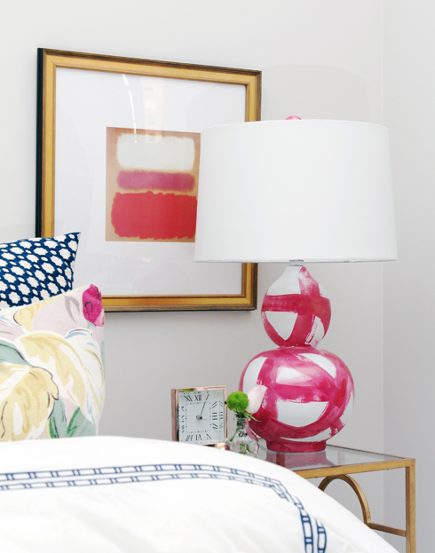
I love my space because it feels bright & airy with a few punches of color. As it’s a very small New York studio apartment, I set it up like a hotel room to maximize seating and to keep an open flow. As the one space needs to function as a bedroom & living room, I choose to show off my bed, friends often sit at the end of it, we pull out the stools from under the console & it allows me to entertain with ease.


I also love that my apartment is a collection of high & low. I was very patient in putting it together, the console is from Ikea, the floral pillows are made of vintage bark cloth I sourced on Etsy, & the lamps are a DIY which you can read more about here.  The colors in the bark cloth pillows were actually the inspiration for the palette of the room, mostly neutral with pops of fuchsia, turquoise, & jade green. The more high-end items are mostly from One Kings Lane, so though they were investment pieces, I still got them for a steal. 

Because this is a studio apartment we don't have a lot of peeks into many rooms but I think what Jana did with this small space is amazing!

 (I also picked the Land of Nod winner last night so scroll down to see the winner!)


Here is a small peak into her little bathroom.


Thanks Jana! Make sure you check out her site here.

Go here to check out past Feature Fridays.


photography by Erik Melvin